
Cholera Outbreak Dashboard
An interactive visualization mapping the historical spread of cholera, featuring geographic distribution and timeline analysis of disease outbreaks.
TableauEpidemiologyGIS
View Interactive DashboardExplore my collection of interactive Tableau dashboards that transform complex data into actionable insights through intuitive visualizations.
An interactive visualization mapping the historical spread of cholera, featuring geographic distribution and timeline analysis of disease outbreaks.
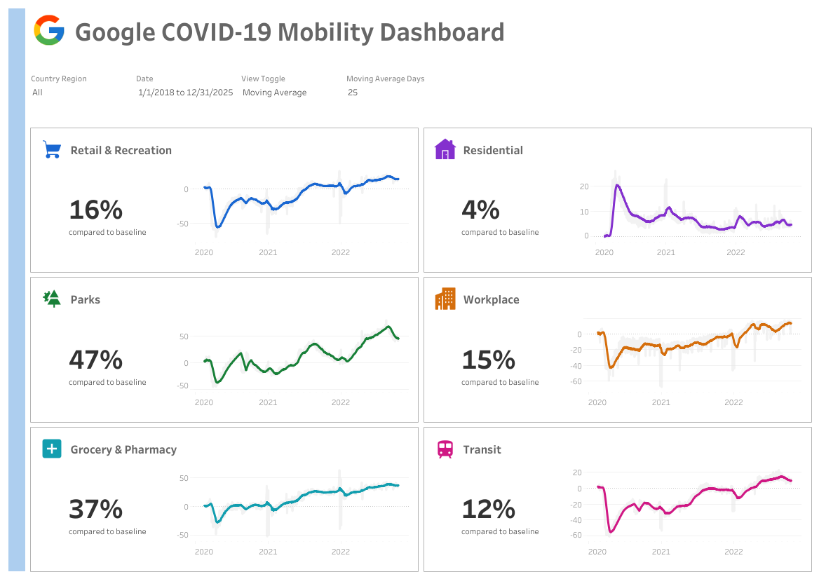
An interactive visualization of Google mobility data during the COVID-19 pandemic, showing how population movement changed across different regions and venues.
I'm currently working on new Tableau projects in the following areas:
Interested in seeing more of my data visualization work?
Visit my Tableau Public Profile